
Building a multi-product design system from the ground up to connect global teams to a single design language.
Art Direction / UI / System Architecture
Contributors
Dan Rader, Project Lead
Maggie Chambers, Lead Design
Scott Donaldson, Development
Aaron Wentt, Development
Fernando Castro, Development
Camille Tucker, Product Management

2021 was a year of rapid growth for Xplor….
Following a strategic acquisition, the company had dozens of independent teams and technologies trying to operate as a single global organization. The product offering was an amalgamation of wildly different brands, interfaces, and patterns. There was no consistency between products, which created a disjointed user experience and a lack of trust from our clients. In addition, the inconsistency between products also caused internal inefficiencies as maintaining multiple and conflicting design systems was an unsustainable and ineffective use of resources.
The Situation

As such, we needed a single design system to:
The Task
Drive consistency and promote accessibility across our applications
Increase the speed and efficiency of our teams
Improve brand perception and trust by aligning products under the Xplor brand
As the Design Lead, I helped establish the creative direction of the design system; made sure we stayed true to our goals; and led a multidisciplinary team of design, product, engineering, and business stakeholders to execute and implement the design system and document the process.
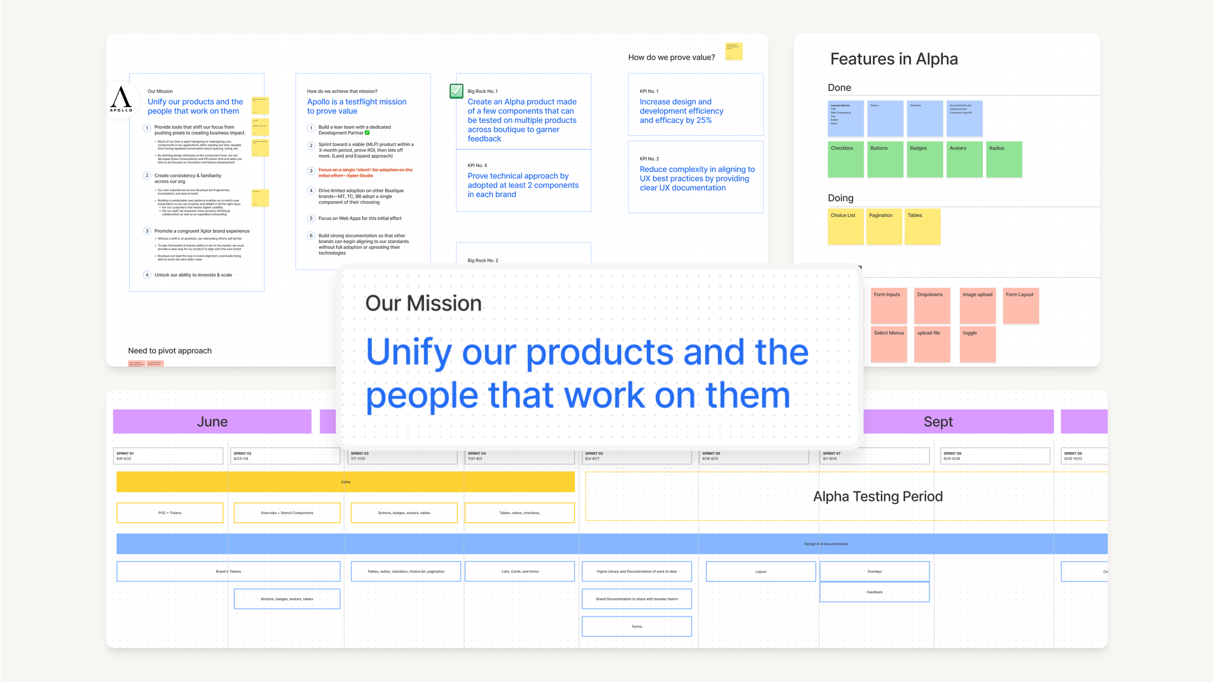
Step 1
Translating the Brand
A new Xplor brand provided the company with a sense of unity. We now had colors, shapes, fonts, imagery, and a logo with which to identify. But these foundational elements did not yet directly translate to the products.
Before creating the system, a level of style exploration was needed. We considered elements like how and where color is applied, gradients, border radiuses, drop shadows, data visualizations, illustration style, imagery, and more. This exercise allowed us to quickly “try out” various visual directions the new system could take before landing on the core set of visual principles that best reflected the Xplor brand.
Extending a brand into a practical, accessible, and modern UI
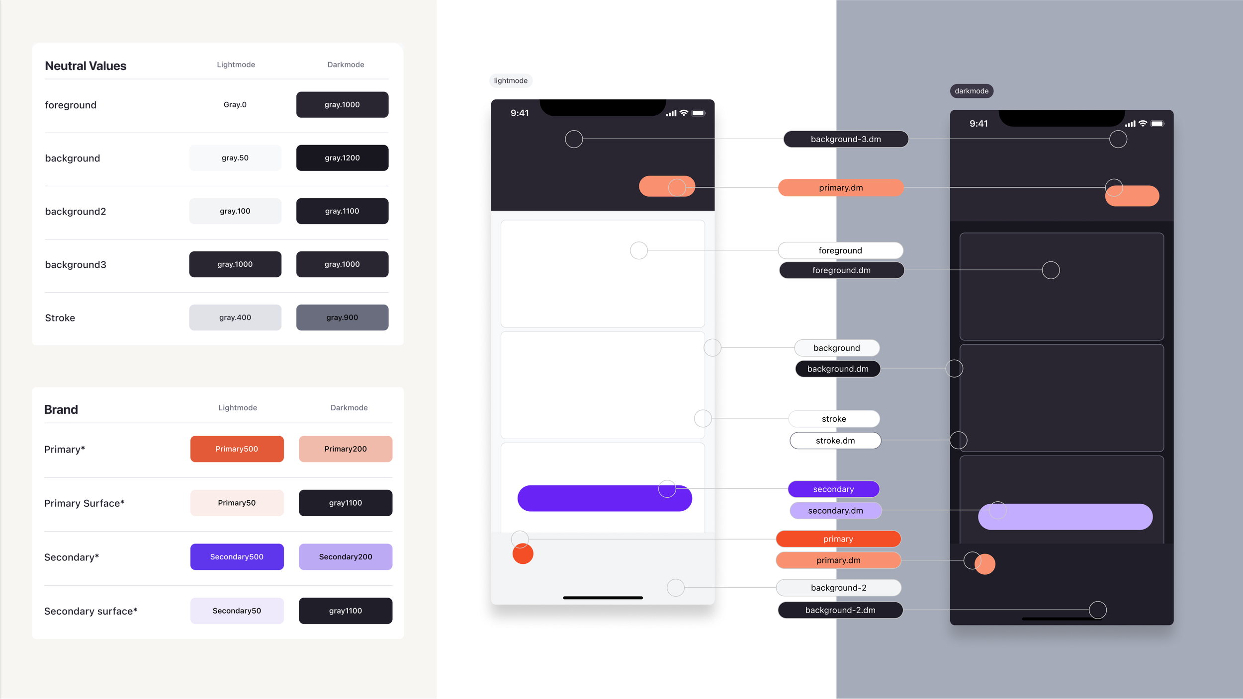
Among other things, the Xplor brand roll-out lacked an extended color palette necessary for our interfaces to have proper depth, focus, and accessibility. This was especially true given the fact that we were planning to tackle dark mode, which relies heavily on a robust and nuanced neutral palette. We let the brand guidelines indirectly inspire the UI color palette.

Step 2
Establishing Foundations
Once the visual style was established, we captured decisions about fonts, colors, spacing, borders, and shadows, among others, in the form of tokens, which combine to form the Apollo Foundations.
Apollo Foundation was separated from the component library so designers and developers could use it for the framework they need—Web, iOS, Android. This provided a layer of opinion needed to help products immediately look and feel like “Xplor”, we could now simply reference the foundations’ library for an individual product before fully committing to updating all of the components.
Additionally, we set a rule for ourselves to support dark mode out of the box. That meant that each system token (and component) would have both a light and dark mode output. This opened up more flexibility for our applications, creating a wider range of background options while maintaining optimal hierarchy and contrast.
This made a world of difference in our ability to scale to iOS and Android which have requirements to support both.
Wranglin’ Dark Mode


Step 3
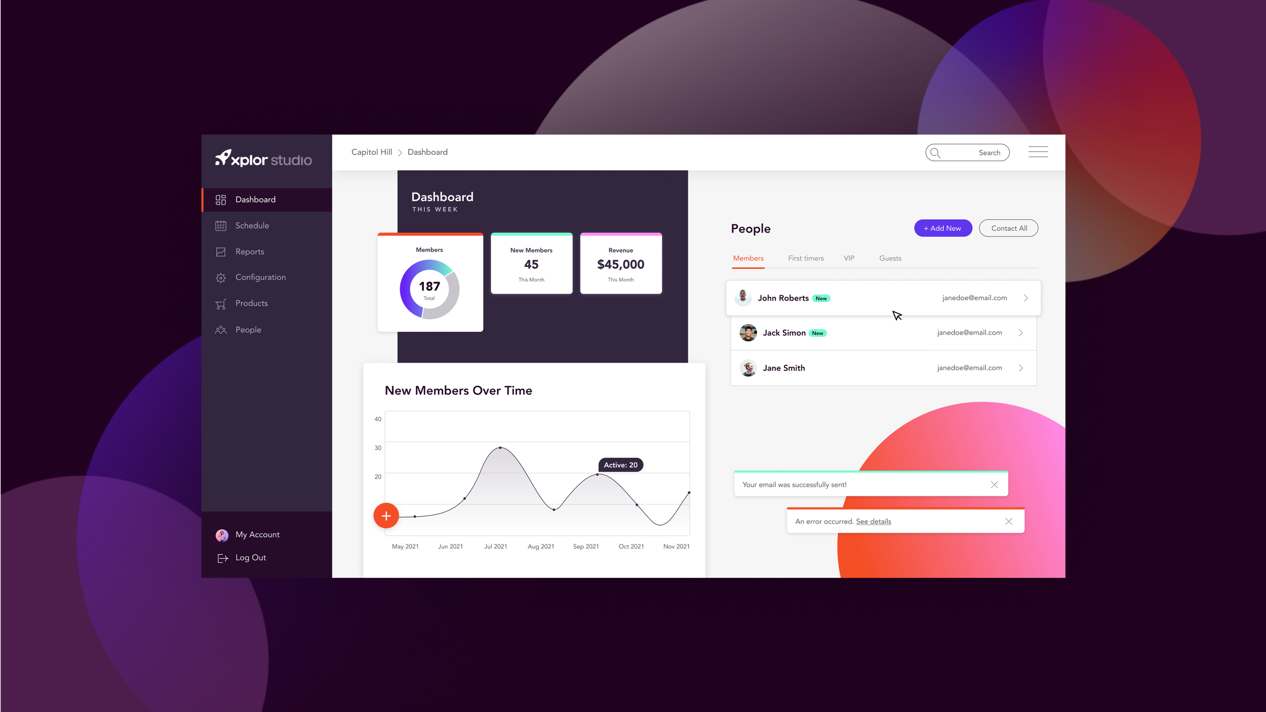
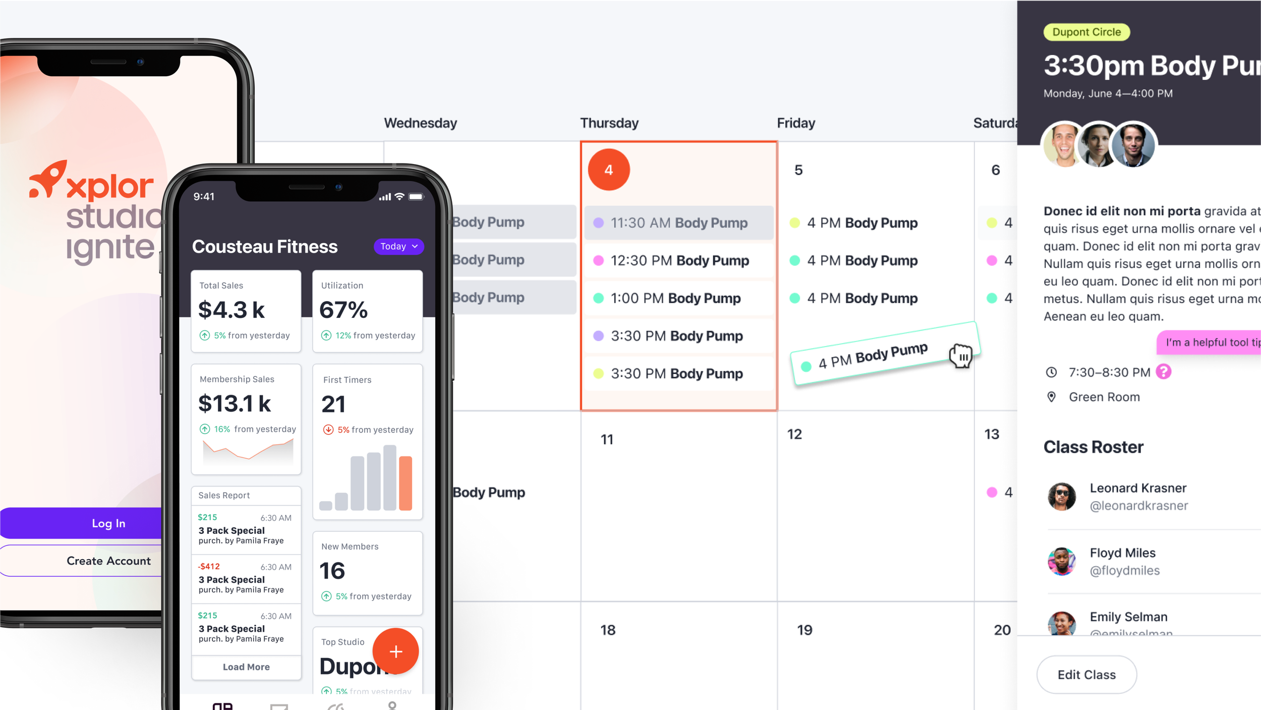
Building Components
An audit of all our products was conducted to identify the most common and reusable components and layouts we would need to create. Every application needed core UI elements like buttons, inputs, tables, and more.
Within each of these components, there were specific needs for its application (error states, disabled states, light mode, and dark mode versions, etc). So we as a team dove head first into each component, understanding it from the inside out, taking stock of industry best practices, adding guidance and consistency, and building it directly into our Figma library.
In addition to that, It was imperative that our components were built to help designers design, which meant fully utilizing Figma’s auto-layout and variation features to make customizing components a breeze.
A design system is as good as its documentation. We’re integrated with Storybook and Zeroheight to capture our code, tokens, and components, and to put words to the decisions and rules that keep our systems consistent. These tools allow everyone to contribute to documentation while saving time. While documentation is still in progress and there’s a long way to go, the team has set a goal to achieve 100% documentation by end of Q2 2023.
Documentation


Within 12 months of launching the Apollo Design System, 75% of Xplor products across the global brand (25+ products) are now using it. With a shared vernacular, designers and developers are now able to exchange files and collaborate more efficiently. Designers are also able to share feedback using consistent language. With a ready-made library of patterns, designers are able to prototype 20% faster.
Most Importantly, our users have a consistent experience throughout our products, contributing to an average 25-point increase in our Net Promoter Score over the last year.
25+ Products
1 Consistent Look and Feel
The Result


What’s Next?
Apollo has been a great tool for driving design understanding within our organization, especially among non-designers, and will continue to be a catalyst for advancing product maturity across Xplor. We are continuing to push for greater adoption of and contribution to the system, and advocating for an additional headcount dedicated to achieving these goals
